Design
UI/UX Design for SaaS & Enterprise Software: What Successful SaaS Products Get Right.
A practical perspective on UI/UX design for SaaS products, based on real challenges faced by scaling teams and evolving software.
Most SaaS products don’t struggle because they lack features. They struggle because, as they grow, the experience quietly becomes harder to use. What once felt straightforward starts feeling heavy. Screens demand more attention. Users pause more often. Tasks that should feel routine begin to require thought. Nothing is technically broken, yet confidence starts to drop. This is usually the point where UI/UX design stops being about refinement and starts becoming about momentum.
This article is written for:
Especially teams that feel their product is solid, but user experience is starting to slow growth.
Early on, users are forgiving. They explore, experiment, and adapt. But as a SaaS or enterprise product matures, the context around it shifts. New user roles are added. Workflows overlap. The product is no longer explored occasionally. It is depended on daily.
At this stage, even small design decisions compound. Interfaces try to serve too many needs at once. Dashboards become dense. Onboarding assumes familiarity that new users don’t yet have. The product still works, but it demands more effort than it should. That subtle friction is where many growing products begin to slow down.
Good SaaS UI/UX design usually begins by stepping back, not jumping into screens. The focus shifts from what the product can do to how people actually use it. Where users hesitate. Where they double-check themselves. Where the interface fails to reassure them.
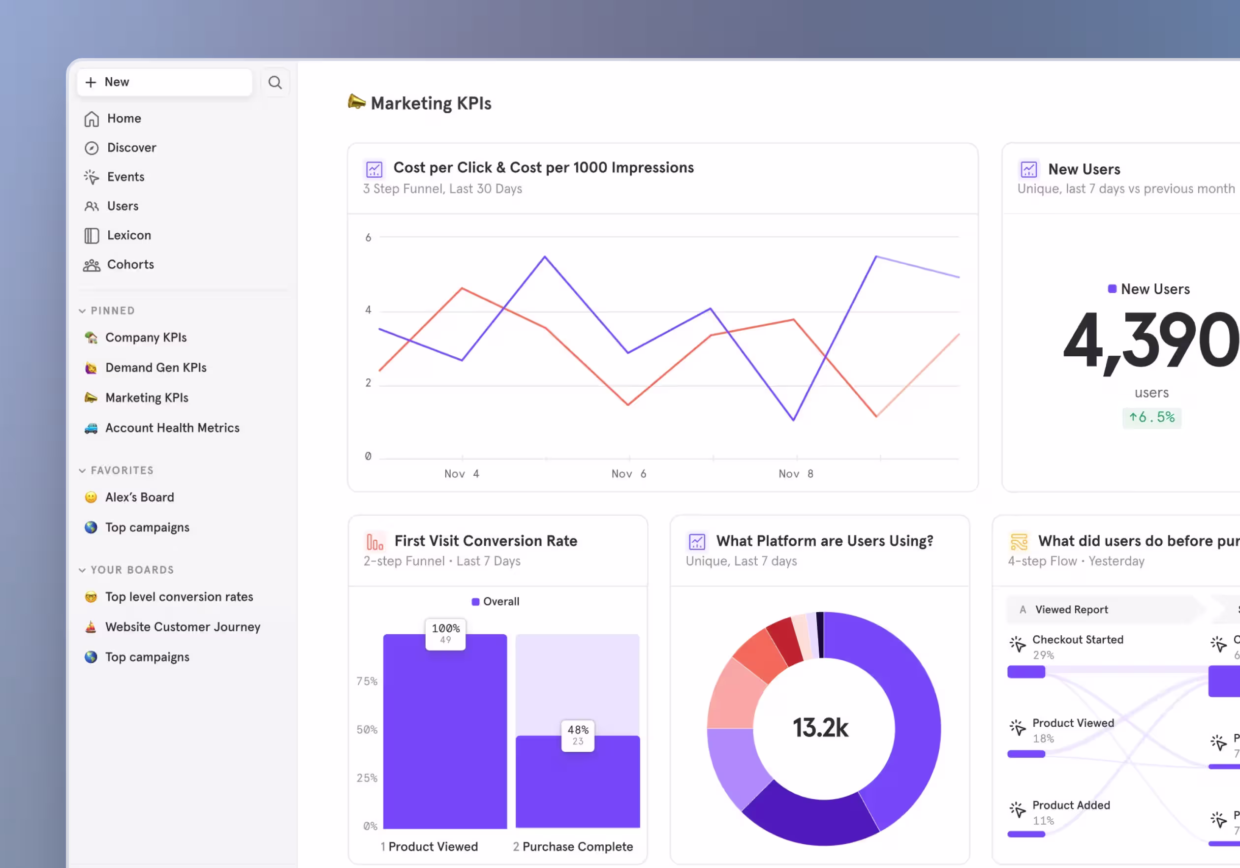
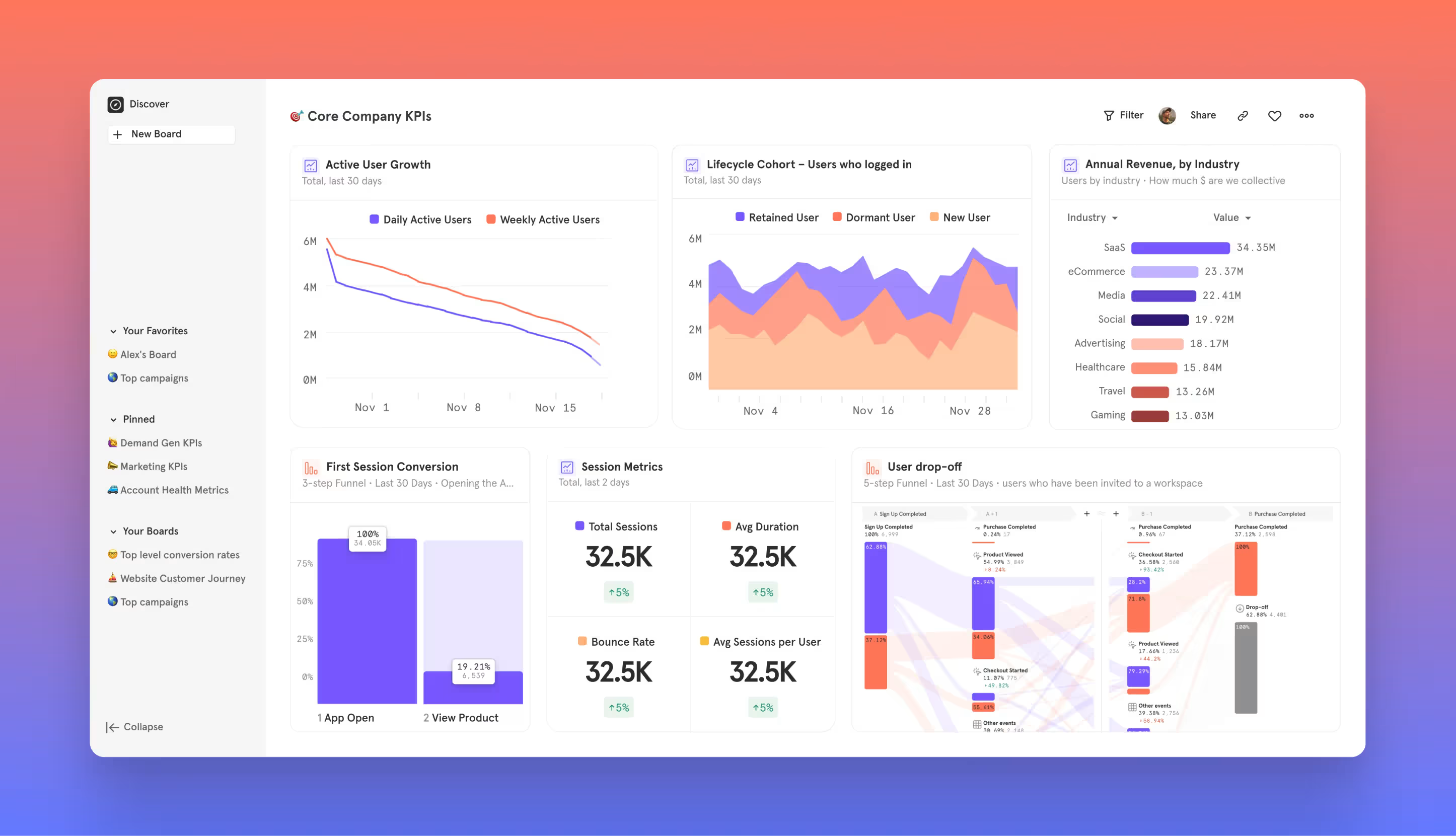
In complex products, especially enterprise software, clarity matters more than completeness. Showing everything at once might feel transparent internally, but for users it often creates noise. Strong products make deliberate choices about hierarchy. Primary actions are easy to spot. Secondary information is available without competing for attention. Advanced controls exist, but they don’t dominate the experience.
This is also where onboarding plays a critical role. Onboarding is not a tour or a checklist. It is part of the product experience itself. When onboarding focuses on real tasks instead of feature explanations, users understand value faster and feel more confident using the product.
We saw this clearly while working on the SaaS design for Cimmra, a supply chain and procurement platform used by operational teams. The challenge wasn’t complexity. It was how that complexity was presented. By restructuring information hierarchy and interaction patterns, the product began to feel calmer and more intuitive without reducing functionality.
As products evolve, inconsistency tends to creep in quietly. New features are added under time pressure. Different teams interpret patterns slightly differently. Over time, the interface feels less predictable.
This is where systems thinking becomes essential. Design systems are not about visual polish. They are about behaviour. When interactions are consistent, users stop relearning the product. When patterns repeat, confidence builds naturally. Products that scale well usually invest in this consistency early, even if it is lightweight.
At this stage, design decisions benefit from reflection more than reaction. A few questions often reveal more than a redesign brief:
These questions help teams diagnose experience issues before they turn into business problems.
One common issue in growing SaaS products is designing for internal reassurance rather than user flow. Stakeholders want visibility. Users want momentum. When interfaces try to satisfy both equally, they usually slow everyone down.
Another pattern is waiting too long to address UX issues. Experience problems rarely fail loudly. They surface as slower adoption, increased support dependency, or quiet disengagement. By the time metrics clearly drop, fixing the underlying issues requires significantly more effort.
There is also a tendency to treat UI/UX design as a one-time milestone. SaaS products change constantly. When design does not evolve alongside those changes, friction accumulates even if growth continues.
When UI/UX design is handled with intention, its impact extends beyond the interface. Users adopt features more confidently. Support teams spend less time explaining basics. Products feel easier to trust and easier to recommend internally.
In SaaS and enterprise environments, this directly affects retention and long-term value. Not because the product looks better, but because it respects the user’s time and attention.
Strong UI/UX design is rarely about dramatic redesigns. It is about reducing friction steadily as complexity grows.
Before redesigning, diagnose. Understanding where users struggle matters more than changing how things look.
Design for confidence, not just completion. A task finished with uncertainty still creates friction. Prioritise consistency as products scale. Predictable interactions make complex systems feel manageable. Treat onboarding as part of the product, not an introduction to it. Think in systems, not screens. Products that age well are designed that way.
UI/UX design is not about making SaaS products look impressive. It is about making them feel reliable as they grow. The products that scale well are rarely the loudest or the most feature-heavy. They are the ones that quietly reduce friction over time and help users stay focused on their work. That is where good design does its most important work.
If you are a product manager or a SaaS founder reading this and some of these points feel familiar, you’re not alone. Most teams sense that something in their product experience could be better, but it’s often unclear where to start or what actually needs fixing.
This is where an outside perspective can help.
At Tangle, we often begin our work with a UI/UX design audit. It’s a practical, no-fluff review of your product that focuses on clarity, usability, and real user experience. The goal isn’t to redesign everything, but to give you a clear view of what’s working, what’s creating friction, and what’s worth prioritising next.
If you’d like, we’re happy to offer a free initial design audit for SaaS and digital product teams. It’s a simple way to get clarity before making bigger design or product decisions.
No commitments. Just thoughtful feedback from people who work closely with complex products every day.