Cimmra
How Cimmra’s Identity Architecting Trust for the Modern Web
Brand identity refresh and website redesign to strengthen credibility, drive inquiries, and position Genesis as a top choice for science education.
Tangle partnered with Cimmra to architect a scalable corporate brand identity. We moved beyond generic tech tropes to build a design language rooted in precision, combining a confident blue palette with a tri-font typography system designed for high-density interfaces. The goal was not just a logo design refresh, but a comprehensive system that bridges the gap between marketing appeal and product utility.
What we did
— Brand Strategy
— Visual Identity System
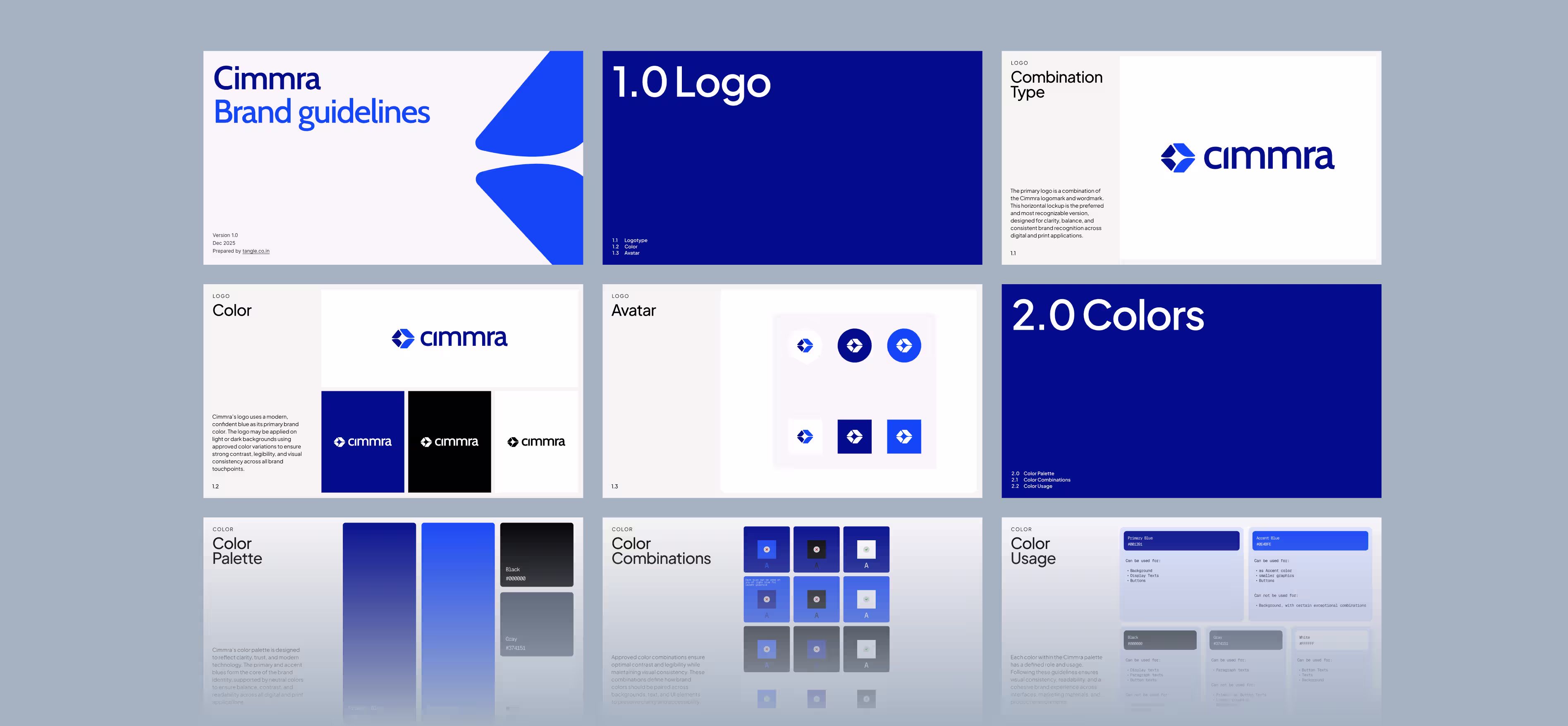
— Brand Guidelines
Key Metrics
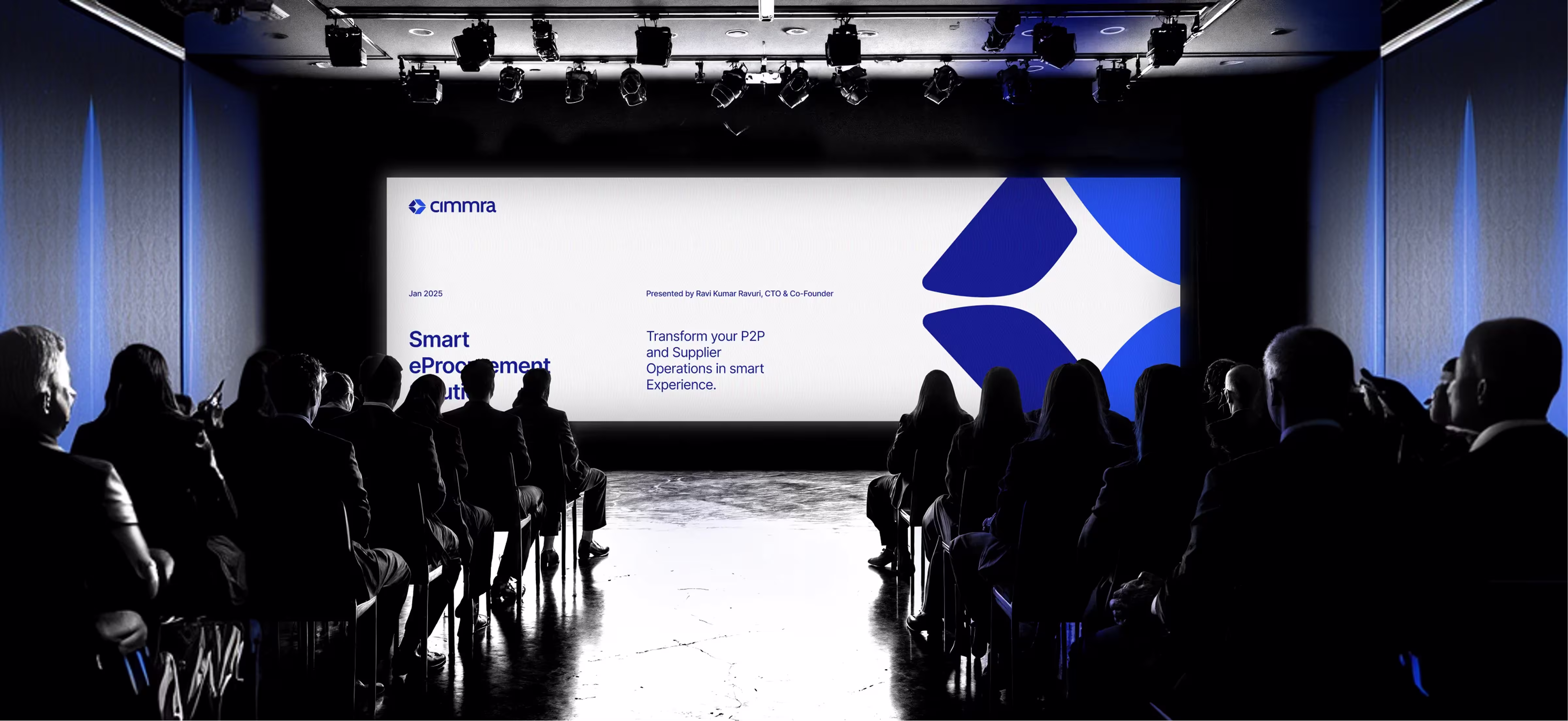
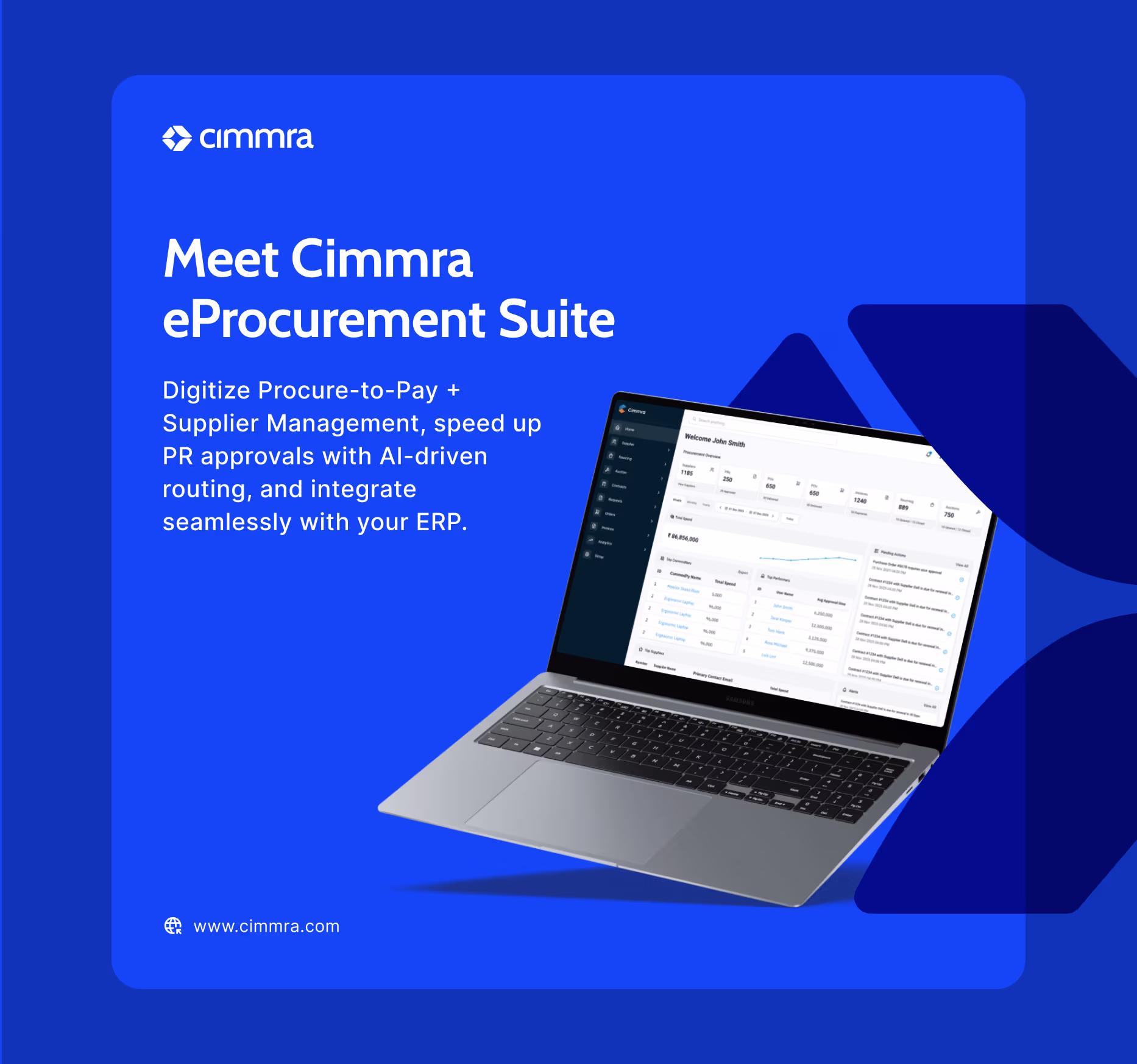
Cimmra needed an identity that communicated authority without feeling legacy. We developed a "Combination Mark" system that maintains legibility across everything from favicons to billboards, establishing a unified voice for their technology.
25%
Increase in Demo Requests
3x
Vendor Credibility Lift
90%
Enterprise Readiness
20%
Faster Onboarding
Challenge & Outcome
In a crowded SaaS market, clarity is the ultimate differentiator. Cimmra’s existing visual language lacked the weight required to compete with enterprise giants. They needed a brand identity that communicated authority without feeling "legacy."
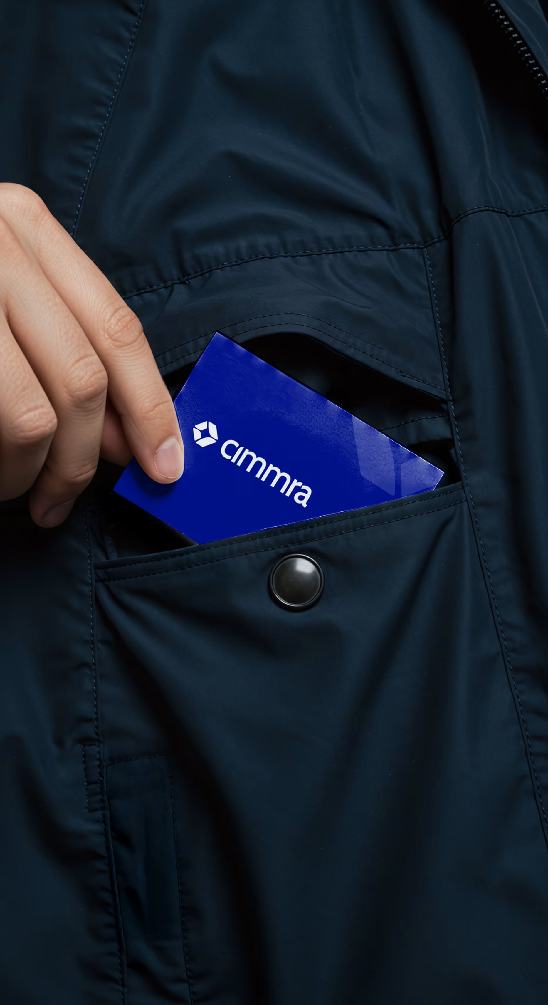
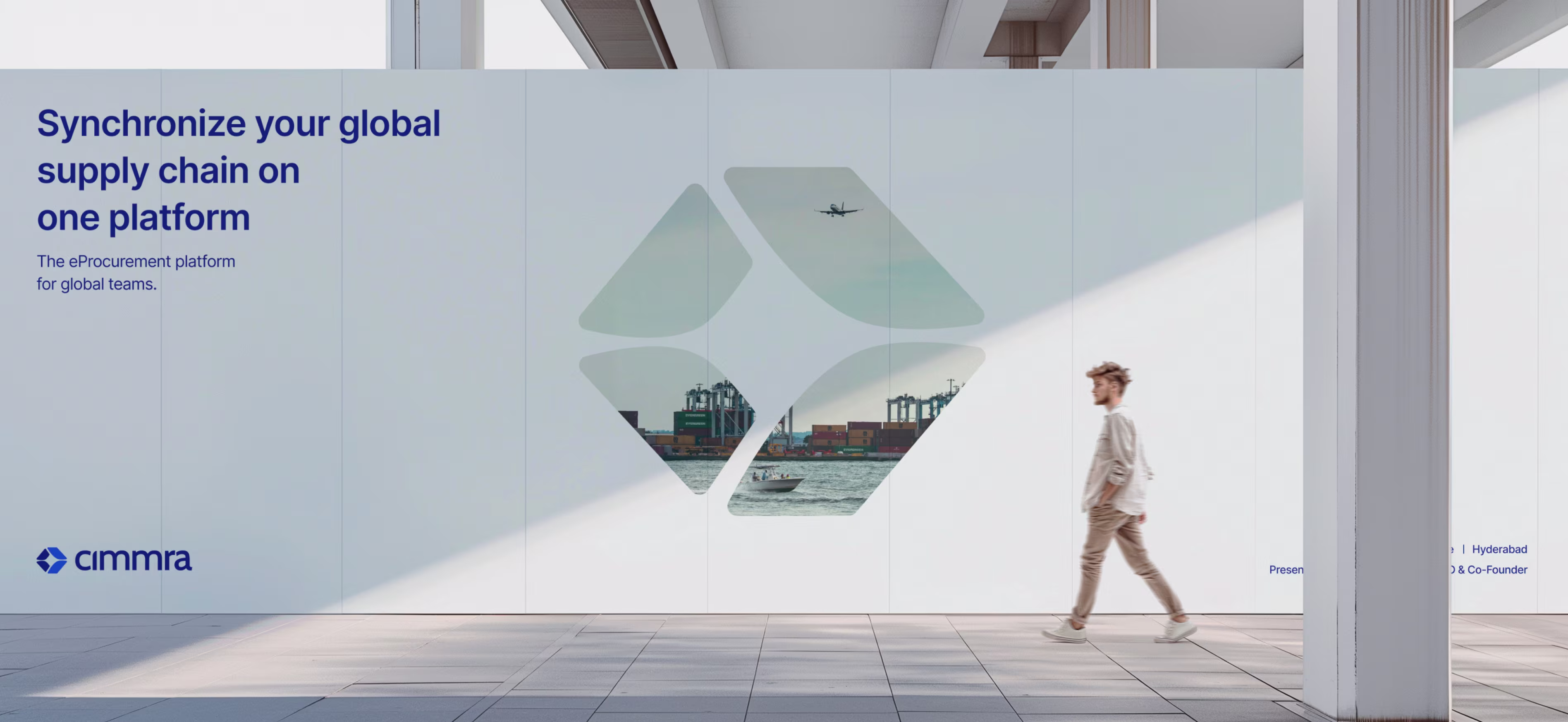
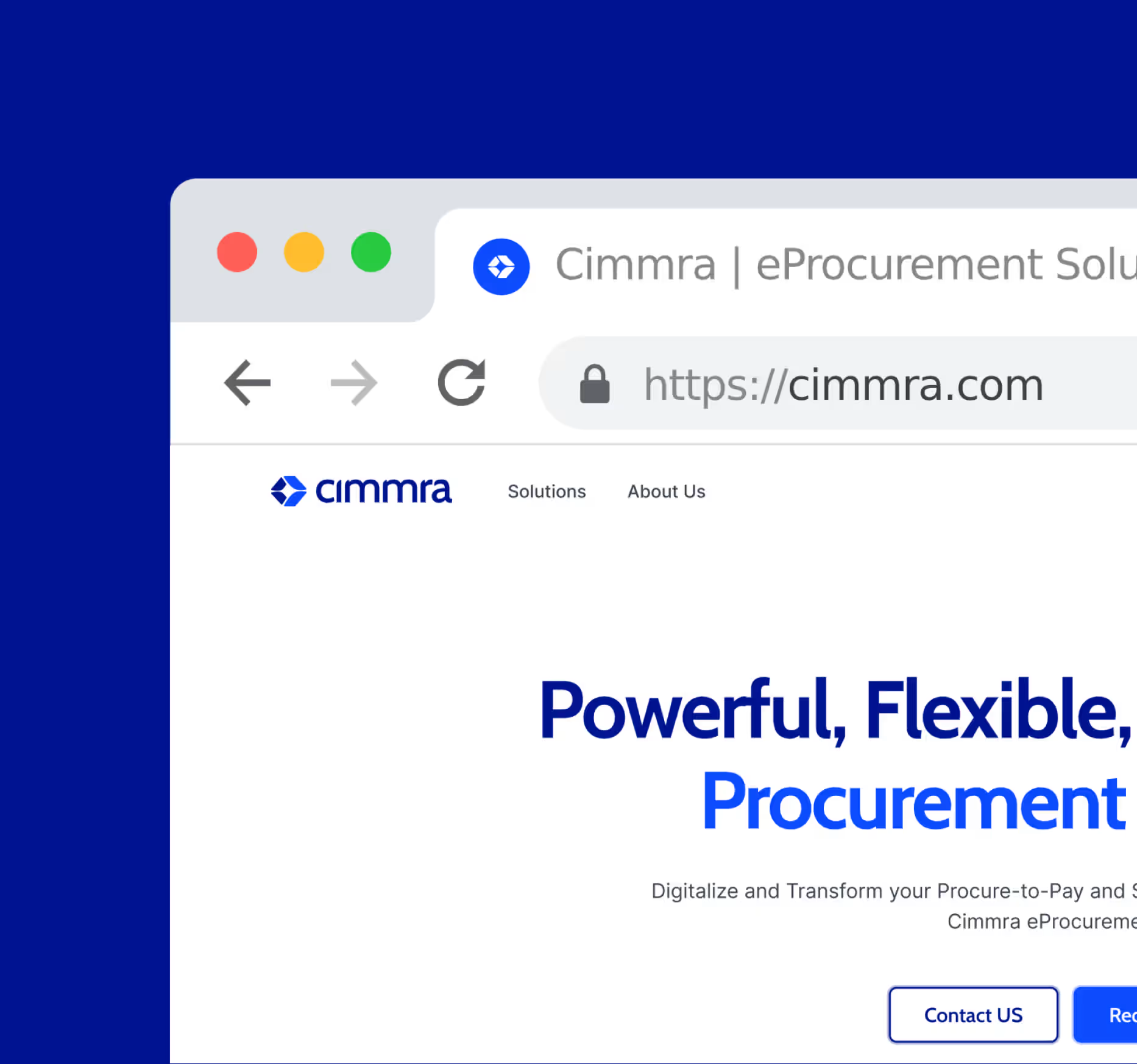
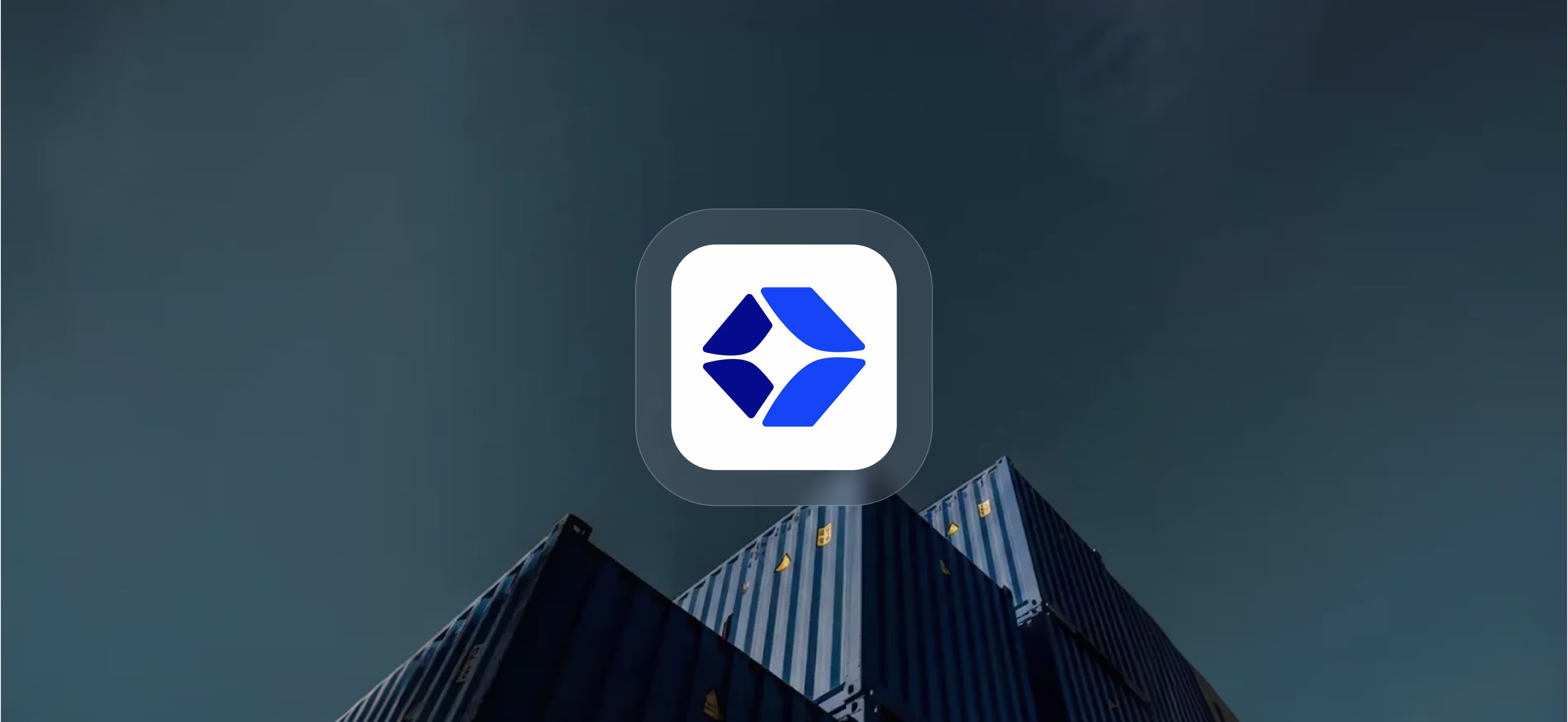
Our solution was a "Confident Blue" system paired with a geometric logomark. The new logo design is engineered to be applied on light or dark backgrounds with equal impact, ensuring the brand remains recognizable across everything from favicons to billboards.
The Process
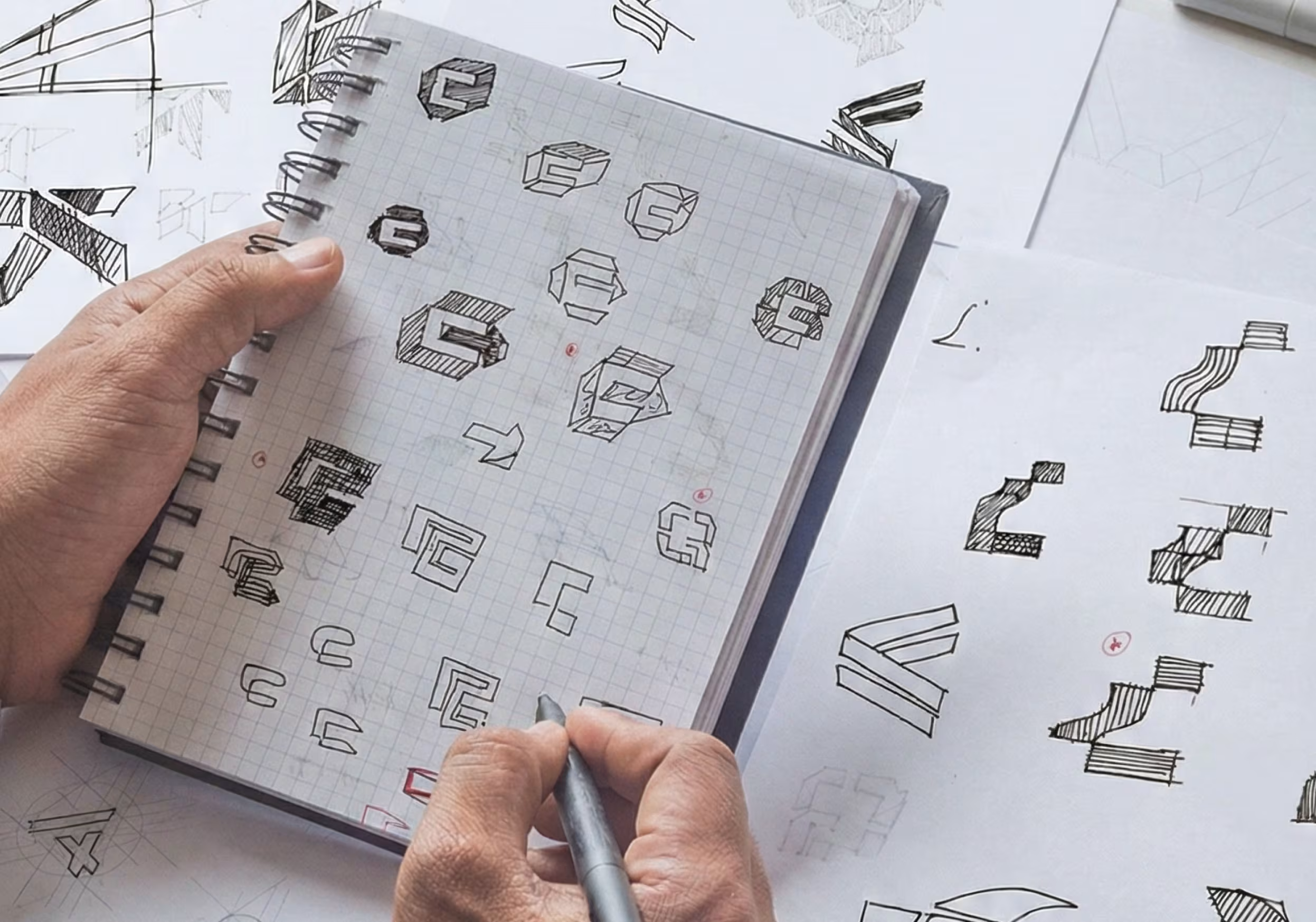
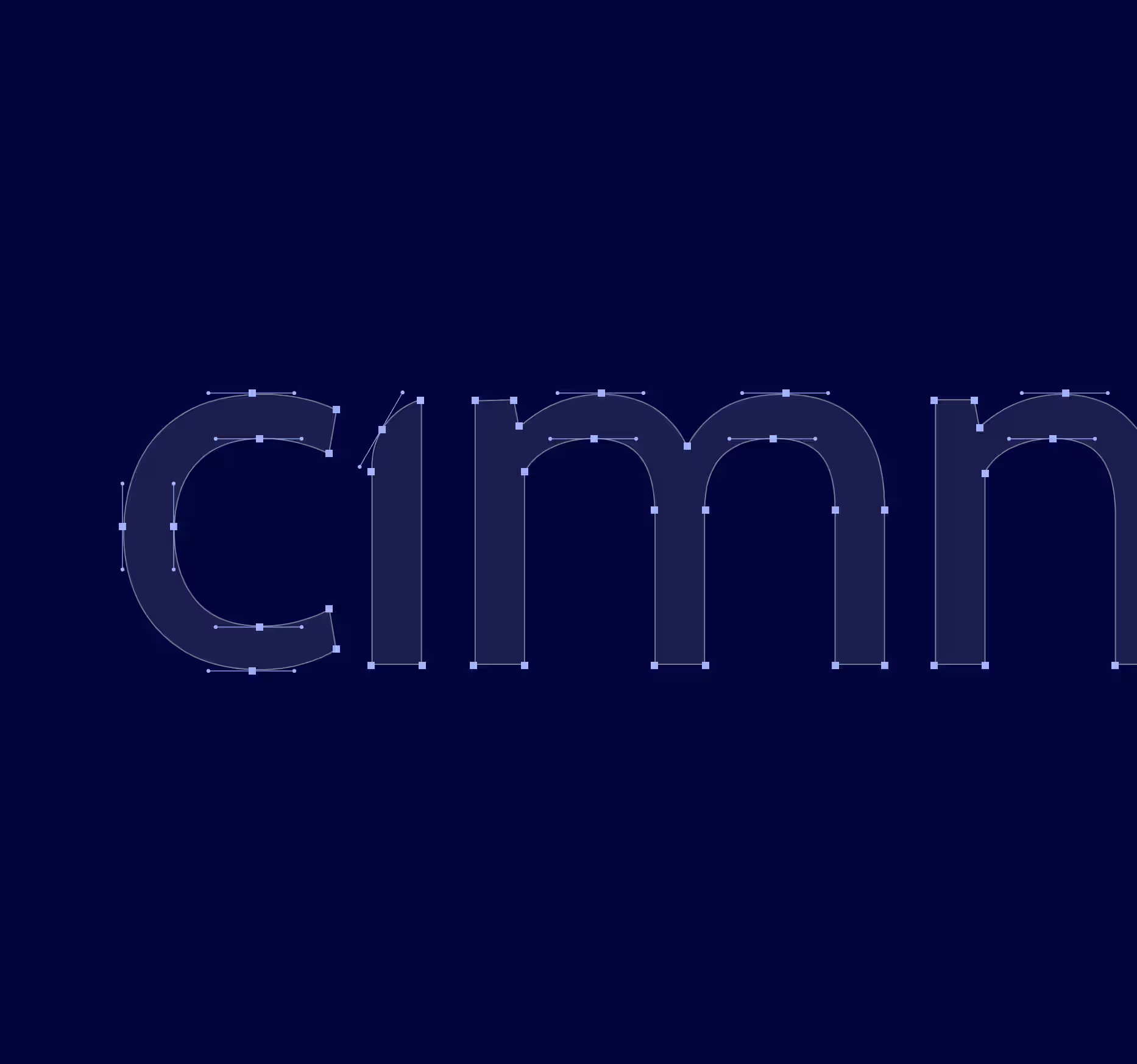
Finding the Angle: 20+ Iterations to Clarity. Simplicity is complex. To create a custom logo design that embodied "modern technology," we eliminated the excess.
We began on paper, exploring numerous geometric variations. We tested abstract nodes, industrial blocks, and fluid shapes. The breakthrough came with the "box" geometry a shape suggesting stability and dimension. By refining the angles, we crafted a mark that maintains the weight of Primary Blue while being legible at small sizes.
We began on paper, exploring numerous geometric variations. We tested abstract nodes, industrial blocks, and fluid shapes. The breakthrough came with the "box" geometry a shape suggesting stability and dimension. By refining the angles, we crafted a mark that maintains the weight of Primary Blue while being legible at small sizes.
"We deliberately avoided the trend of 'friendly startup' aesthetics. Cimmra's identity is built on 'Gesit Mono' and 'Cabin' a combination that feels engineered, precise, and ready for enterprise scale."
Shekhar Kushwaha
Product Designer
Visual Identity
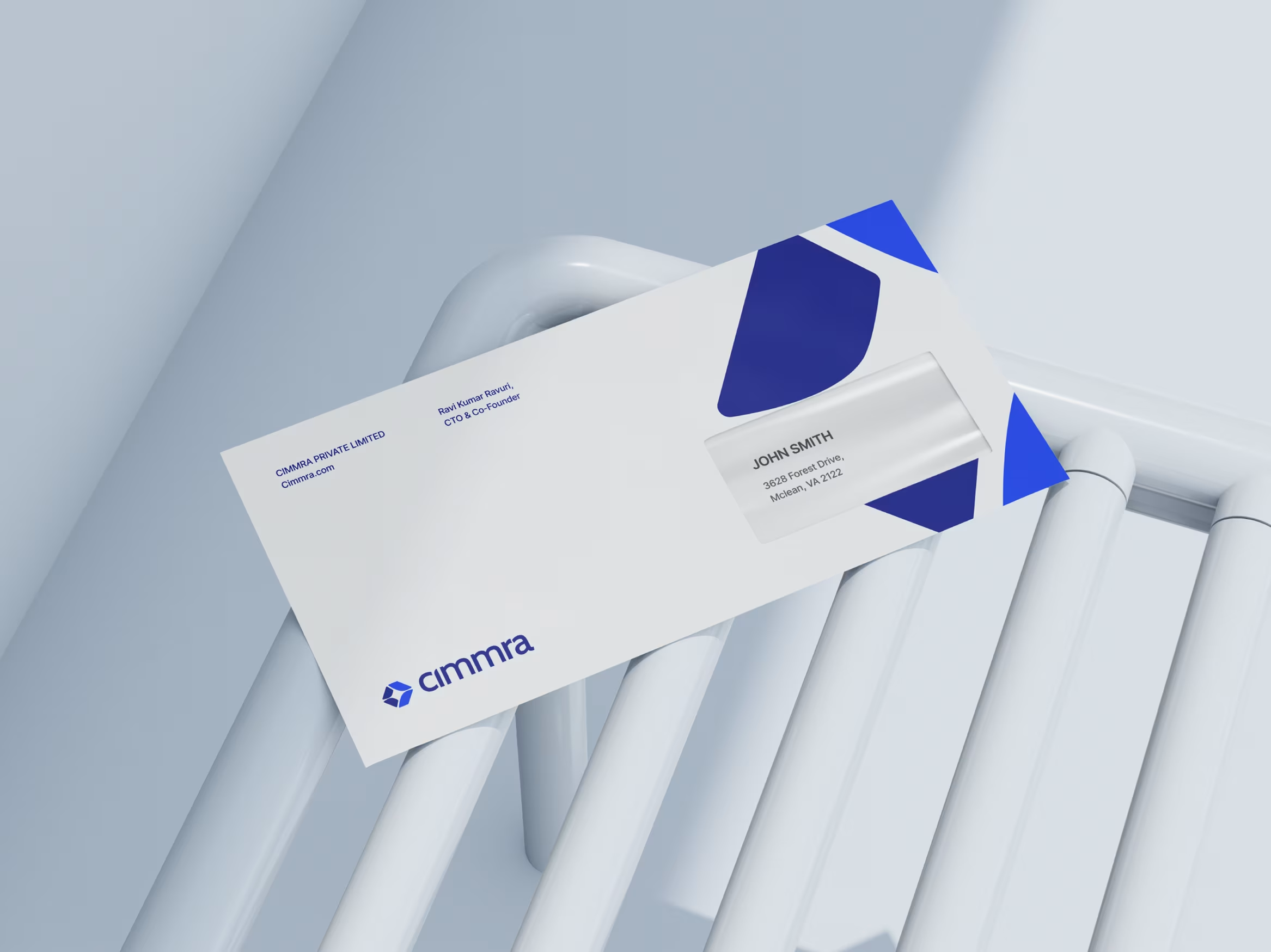
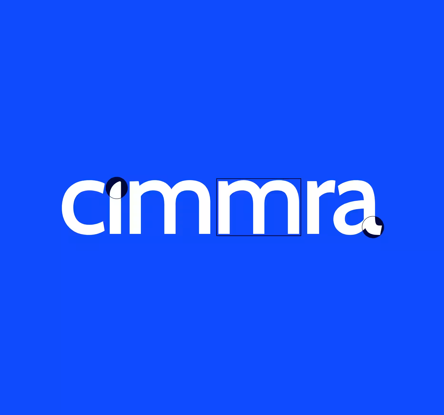
The primary logo is a combination of the Cimmra logomark and wordmark. We designed this horizontal lockup to be the most recognizable version of the brand, ensuring clarity and balance.
The symbol itself reflects modern technology a geometric structure that feels stable yet dynamic. By prioritizing a horizontal lockup, we solved the common SaaS branding problem of vertical space constraints in navigation bars.
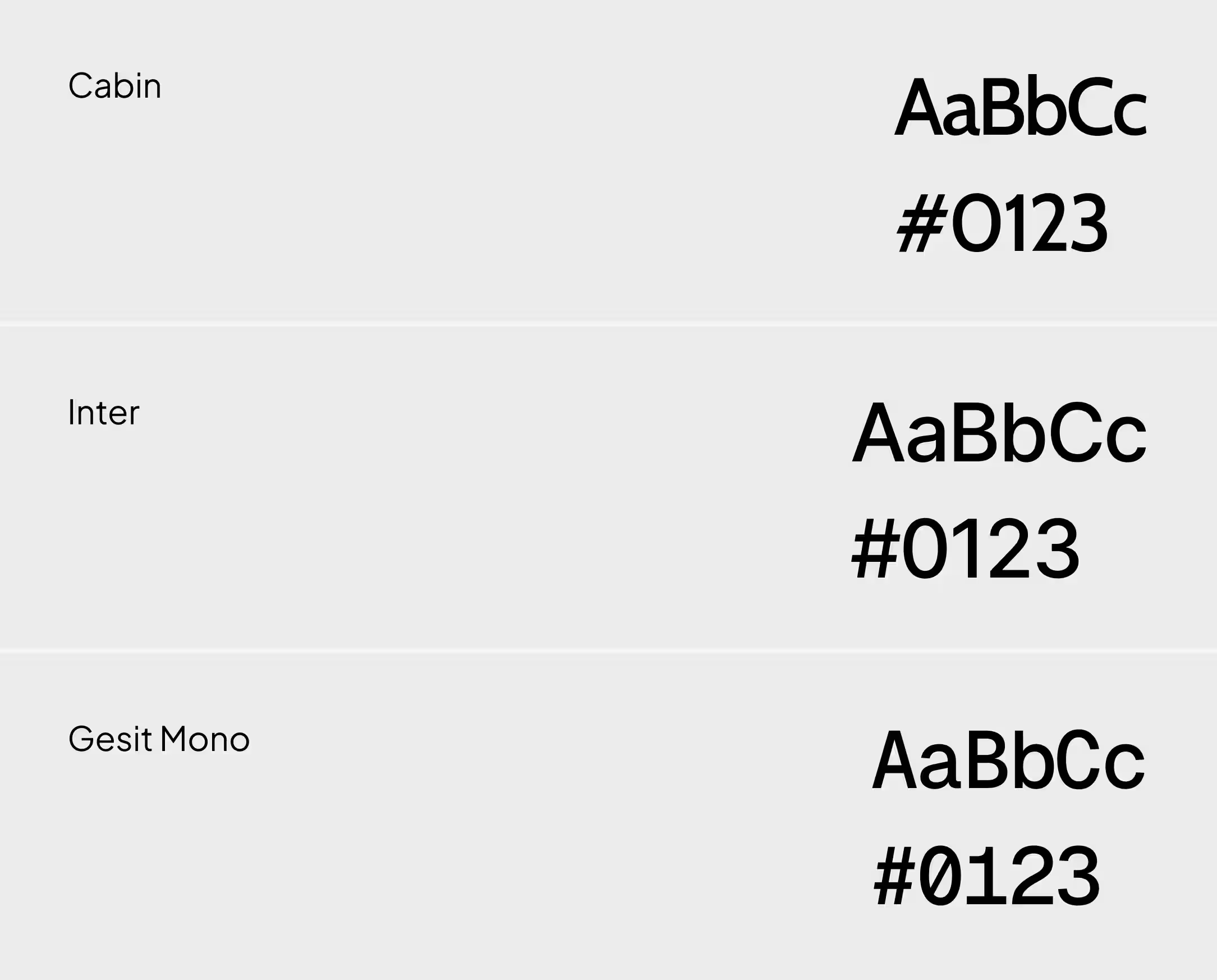
Visual Language
Cimmra's typography system is designed for digital readability and hierarchy. We selected a three-tier typeface stack to handle the complex information density of a SaaS product
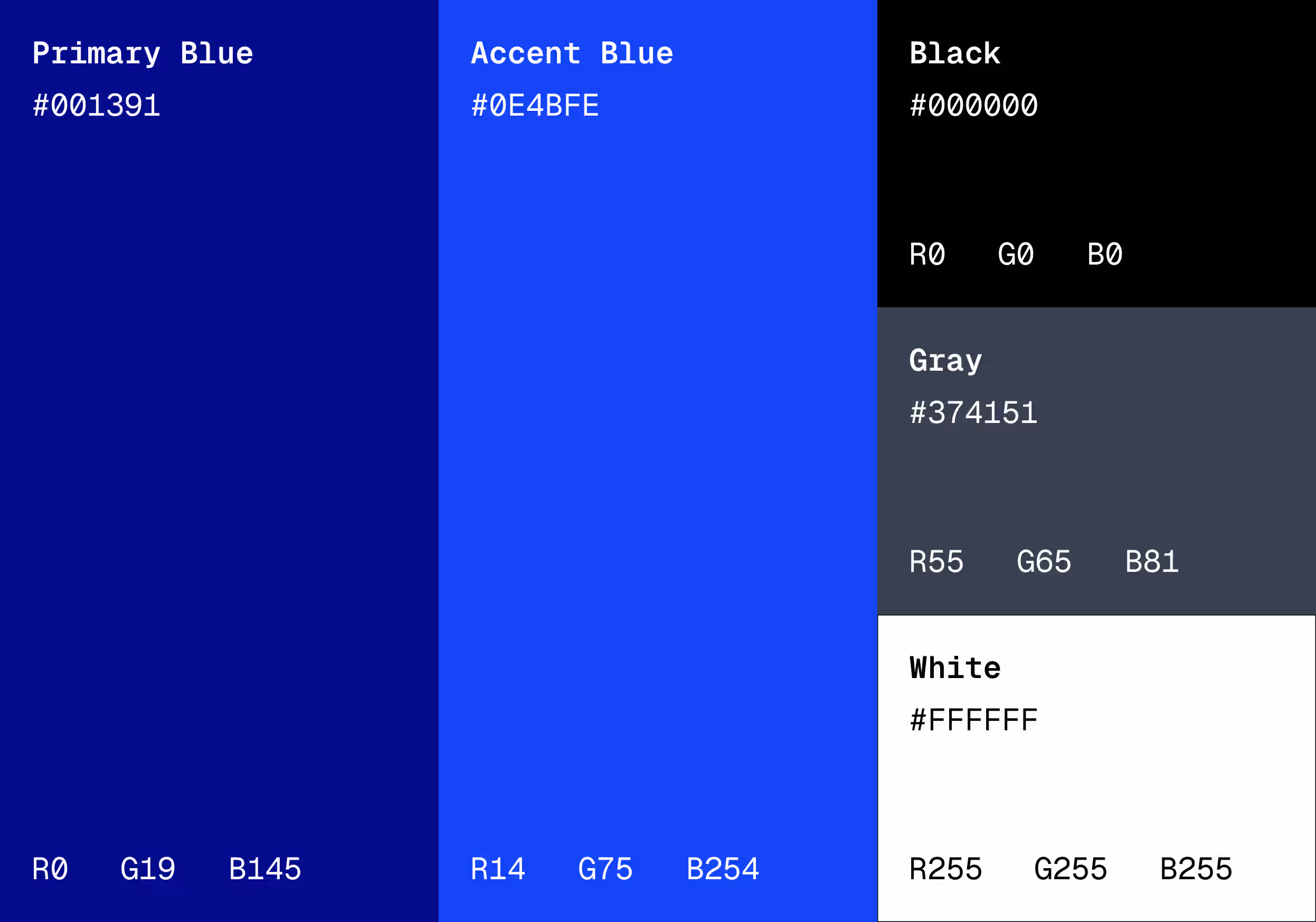
We moved away from ambiguous gradients to a defined palette that reflects clarity and trust. The system is built on two specific blues, each with a strict role to prevent visual clutter
Related work
Healthcare
Woddle Childcare UK
UK’s Best Childcare Platform UI UX Design
Healthcare
Woddle Childcare UK
UK’s Best Childcare Platform UI UX Design

GET IN TOUCH
Discuss your next project with us
Shape What’s Next.


